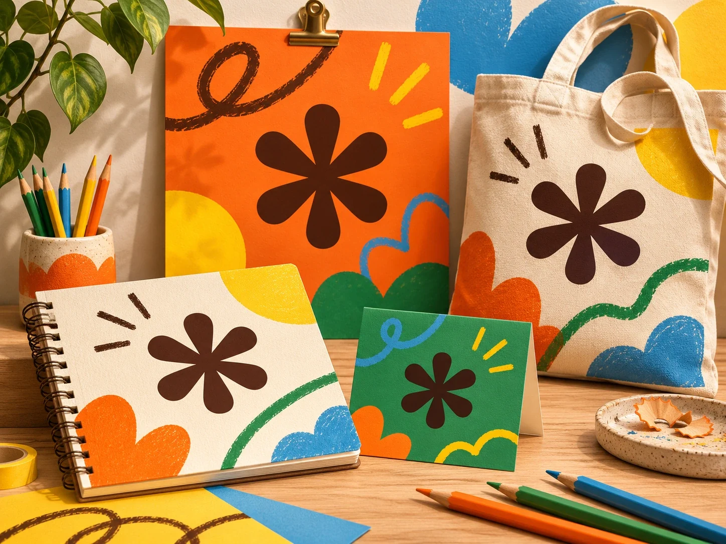
To develop a brand identity with AI, start with the people you want to reach and what you want them to understand. Use that brief to explore possible visual directions. Then choose a style you can apply consistently and test it on the things your audience will see.
A brand identity is the recognisable look and language of a project or organisation. A logo is one part of it. The name, the words on a poster and the way a package looks also shape how an idea comes across.
You can practise with an imaginary project. Perhaps it’s a weekend drawing club, a school plant swap or a repair group for old skateboards. You don’t need to launch a real business to explore how a visual identity works.
For this example, the project is a drawing club for people who enjoy sketching but feel unsure about showing their work. That gives you a useful problem to design around: how could the club look welcoming enough for someone to join?
What should you put in a brand brief?
A useful brand brief explains who the project is for and what it offers. It also describes what someone should understand or feel when they encounter it.
For the drawing club, write a few sentences about who might join and what happens at a session. Use those details to judge whether a proposed design feels welcoming.
Be specific about the situation. A lunchtime club in a busy school corridor needs a poster that someone can understand quickly. A group meeting online may need a small profile image that remains recognisable on a phone.
The Design Council’s Double Diamond starts with understanding the problem, then developing and testing possible answers. For your practice project, that means learning something about the people you hope will join before choosing a visual style.
How can AI help you explore visual directions?
Give an age-appropriate AI tool your brief and ask it to suggest a few possible visual directions. Request an explanation of each suggestion. You might explore loose pencil marks, bold blocks of colour or a simple shape inspired by a sketchbook.
Compare those ideas against the brief. Would the look feel friendly to a nervous beginner? Could someone mistake it for a competition? You can reject an attractive image if it gives the wrong impression.
If you use an image generator, avoid asking it to copy an existing club’s logo or a familiar character. Create an original practice identity and keep track of which elements you made, selected or changed yourself.
How do you keep an AI-assisted brand identity consistent?
Use the same name and saved symbol across your designs. Keep a note of the colours and type styles you select so you can reuse them. Then try the same identity on a poster and a welcome card.
The useful question is whether the pieces feel connected. If the symbol changes shape every time you generate an image, the identity may become harder to recognise. You can use one saved version of the symbol in a layout tool instead of asking AI to redraw it for each application.
Keep important words as editable text. That makes it easier to correct a spelling, change a meeting detail or improve a heading without remaking the whole image.
Same club. Three different first impressions.
Choose a direction for this fictional drawing club. Watch how the poster and welcome card use the same identity.
Warm & welcoming
A place to draw. Room to try.
Bring your curiosity. Start with a line.
Soft cream and green give the words room to breathe. Would this feel comfortable to someone who is nervous about sharing a drawing?
Bold & playful
A place to draw. Room to try.
Bring your curiosity. Start with a line.
Orange, blue and oversized shapes make the club easy to spot. Is the invitation still clear when there is more going on?
Calm & focused
A place to draw. Room to try.
Bring your curiosity. Start with a line.
A quieter blue palette and simple layout put the name first. Does it feel relaxed, or more formal than you intended?
The name and symbol stay the same across both pieces. Which direction best fits the brief, and what would you ask a potential member before choosing?
Test the design at the size people will see it
A poster shown full-screen on a laptop may look clear, then become difficult to read when printed smaller. A detailed symbol might lose its shape in a tiny profile image.
Make a small version and look again. Check whether the name is readable and whether the most useful information stands out. Try a plain background if a busy illustration is competing with the words.
These checks give you a reason to change the design. You’re deciding whether it works in a particular place, rather than adding effects because they are available.
Ask what people think it means
Show the designs to someone who has not read your brief. Ask what they think the club is and who it is for. Avoid explaining every choice before they answer.
If they expect a serious art class but you intended a relaxed sketching group, look at which details might have created that impression. You could adjust the wording, the colours or the image and try again.
Keep the brief and a couple of early versions beside the final design. They give you something useful to discuss: who you were designing for, which possibilities you considered and why you chose this direction. AI can supply material to explore. The judgement about what belongs in the brand is a part you can practise yourself.